
A successful newsletter isn’t just about sending a message… It’s about capturing your subscribers’ attention and building a genuine connection with them. Here are the keys to creating a newsletter that engages and converts:
Why crafting quality newsletters is essential to your marketing strategy
Before diving into the practical aspects, it’s important to highlight the strategic value of newsletters. When well-designed, they are a powerful tool to:
- Build loyalty and strengthen your audience connection: the goal isn’t just to attract customers, but to create an engaged community, one that comes back to purchase, interacts with your content, and becomes a brand ambassador.
- Drive conversions: a good newsletter should either generate revenue or deepen the long-term customer relationship.
- Boost open and click-through rates: every open, every click is an opportunity to engage with your brand, a step closer to purchase. It’s also a goldmine of insights to refine future campaigns.
- Avoid spam filters: the right balance is key. Sending too many newsletters can hurt your deliverability. Ideally, send at least one per month, but no more than one per week, and make sure your targeting is on point. Avoid overly aggressive wording (“free,” “promotion” used repeatedly), and maintain a healthy balance between text and images.
Powerful subject lines and preheaders
Subject line and preheader: the winning duo for newsletter opens
Before your content even gets read, one key duo plays a major role in your email’s performance: the subject line and the preheader. They’re the first elements visible in the inbox, and their job is simple, make people want to click. A catchy subject grabs attention, and a well-crafted preheader reinforces interest.
Here are a few essential rules for writing an effective subject line:
- Get straight to the point: your subject line should clearly reflect the main message of the email, not a secondary one.
- Keep your promises: no tricks, the subject line must stay true to the actual content of the newsletter.
- Be concise: 6 to 10 words max, and make sure it’s readable on mobile. If it’s longer, put key words at the beginning.
- Use emojis sparingly: well-placed emojis can strengthen your message. Poorly used, they hurt readability, credibility… and even deliverability (hello spam folder).
Note: Not all email services display emojis the same way. Some may even replace them with strange symbols.
Test, test, test!
A/B testing is one of the best optimization tools. Test different versions of your subject lines to identify what resonates best with your audience, and adjust your choices over time.
Preheader: the natural follow-up to the subject line
The preheader should not repeat the subject line but support it effectively. It’s the perfect place to:
- Add a contextual note or a subtle call to action
- Use personalization data (first name, product interest…)
- Assert your editorial tone: fun, engaged, expert… Be consistent with your brand identity
Get inspired by these subject line strategies:
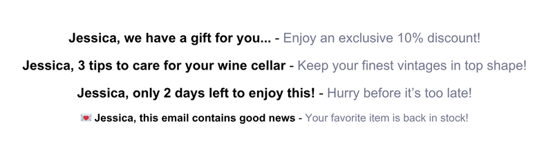
- Offer something: everyone loves gifts or discounts.
- Example: “Jessica, a gift just for you 🎁”
- Spark curiosity (teasing, mystery):
- “A surprise is waiting for you in your inbox…”
- Appeal to emotion: joy, fear, urgency…
- Use numbers or ask a question:
- “3 tips to improve your sleep”
- FOMO (Fear of Missing Out):
“Jessica, only 2 days left to enjoy it!”
→ Our advice: vary your approaches. Alternating prevents fatigue among your audience and keeps the element of surprise alive.
Optimized structure and usability
The effectiveness of a newsletter depends as much on its content as on its structure. A well-designed email captures attention, facilitates reading, and encourages action.
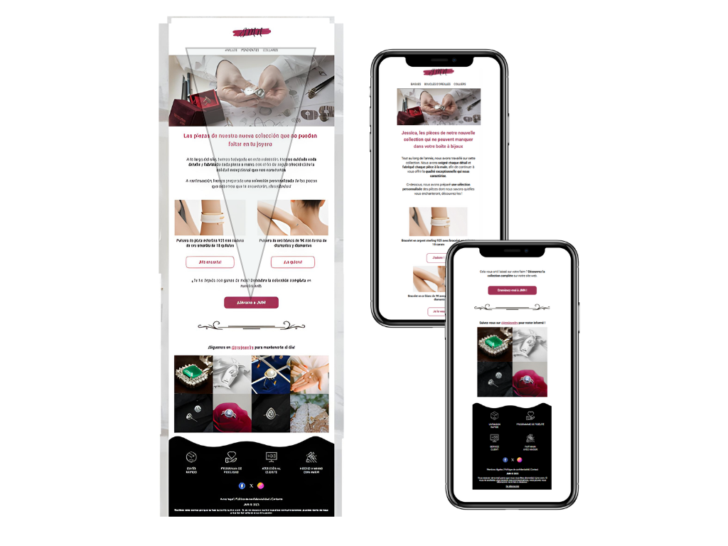
A familiar and reassuring structure
An effective newsletter follows a clear, easily recognizable structure:
- A header with the logo to build trust from the very first seconds.
- An optional menu, useful for content-rich communications.
- A clean and well-structured email body.
- A footer with legal information, useful links, and unsubscribe option.
This layout follows the inverted pyramid logic: you grab attention with a strong message at the top of the email, then naturally guide the reader towards the final call-to-action (CTA).
One key idea per paragraph
Readers often check their emails on the go, between appointments or while commuting. Therefore, it’s crucial to:
- Get straight to the point.
- Limit each paragraph to a single key idea.
- Make reading easy with headings, visuals, and well-spaced blocks.
Image/Text ratio: find the right balance
A harmonious design is not just aesthetic, it’s strategic:
- Recommended ratio: 60% text / 40% images.
- This ratio reduces the risk of ending up in spam folders.
- It ensures good readability even when images don’t load (restrictive email clients).
- It improves accessibility (e.g., for screen readers).
Best practices:
- Include alternative texts (alt-text) for images.
- Never place essential information solely in visuals.
- Check the display on different email clients.
A mobile-first design
71% of users read their emails on mobile. It’s therefore essential to think mobile-first:
- Prioritize content that is readable without zooming or horizontal scrolling.
- Limit mosaics of images that are too small.
- Make sure your links and buttons are easy to click.
With our Fastbuilder editor, two options help optimize your display:
- Adaptive display: certain blocks can be resized or shown differently depending on the device.
- Device-specific blocks: create a desktop version and a mobile version of the same content, and display only the appropriate one.
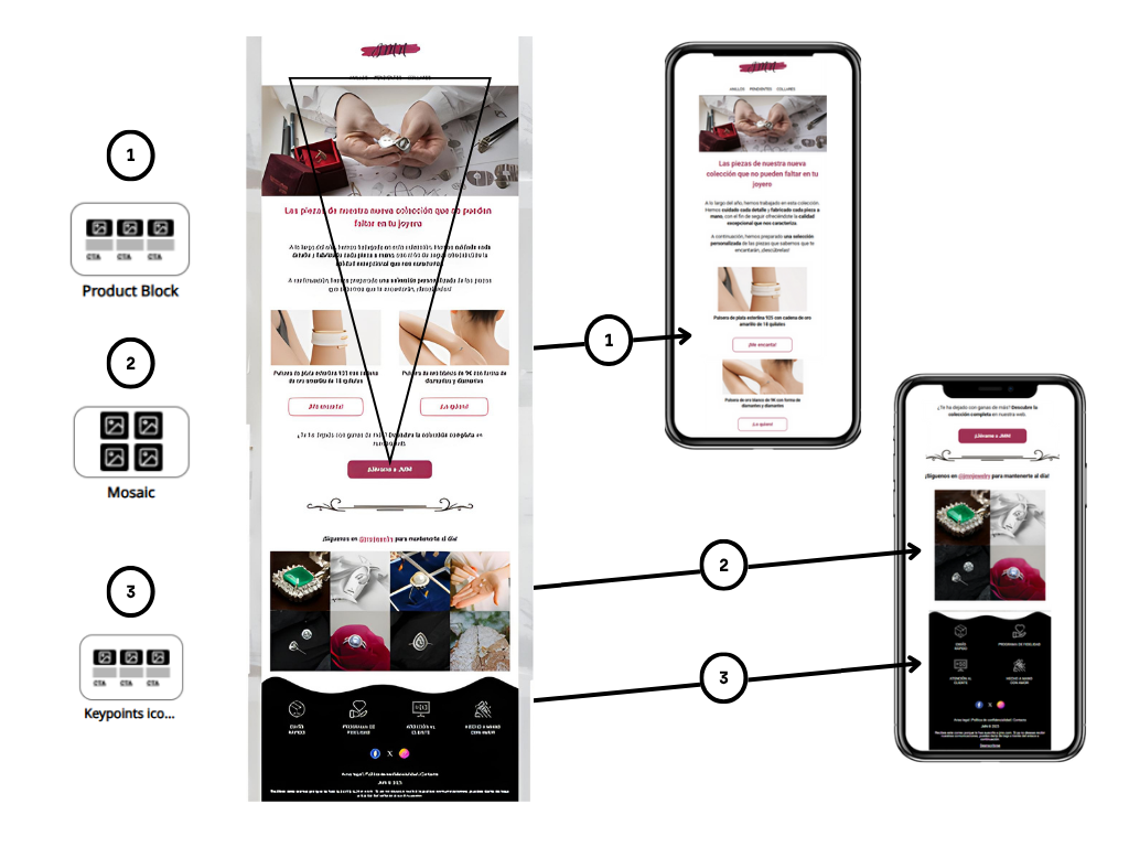
Tip: always use the mobile preview before sending your newsletter!
Persuasive and engaging wording
n a context of heavy email overload, a newsletter has only a few seconds to convince. The goal? To immediately capture the reader’s attention and allow them to clearly identify the key message at first glance.
Design a smooth and effective reading experience
Keep in mind that your readers don’t read every word: they skim and look for the essentials. That’s why every piece of content should be designed with a clear purpose: to subtly but effectively guide them toward the desired action (click, download, purchase…).
- Use clear, direct language consistent with your brand tone.
- Bold key information to improve readability and capture visual attention.
- Write short paragraphs, with one strong idea per block.
Engaging (and not boring) CTAs
Forget passive and generic CTAs like “Learn more” or “Read more.” Prefer active, personalized phrases that relate directly to the desired action:
- “I download my e-book”
- “I book an appointment”
- “I buy with purpose”
Tip: Adapt the verb to your brand’s universe and the campaign’s goal. Test different texts and placements to optimize performance.
Adopt an active and empowering tone
Show that you are in control:
- “We have designed…”
- “We offer you…”
- “Our team supports you…”
Take every opportunity to remind your audience of your brand values, even subtly, in your headlines or descriptions.
Example: launch of a jewelry collection
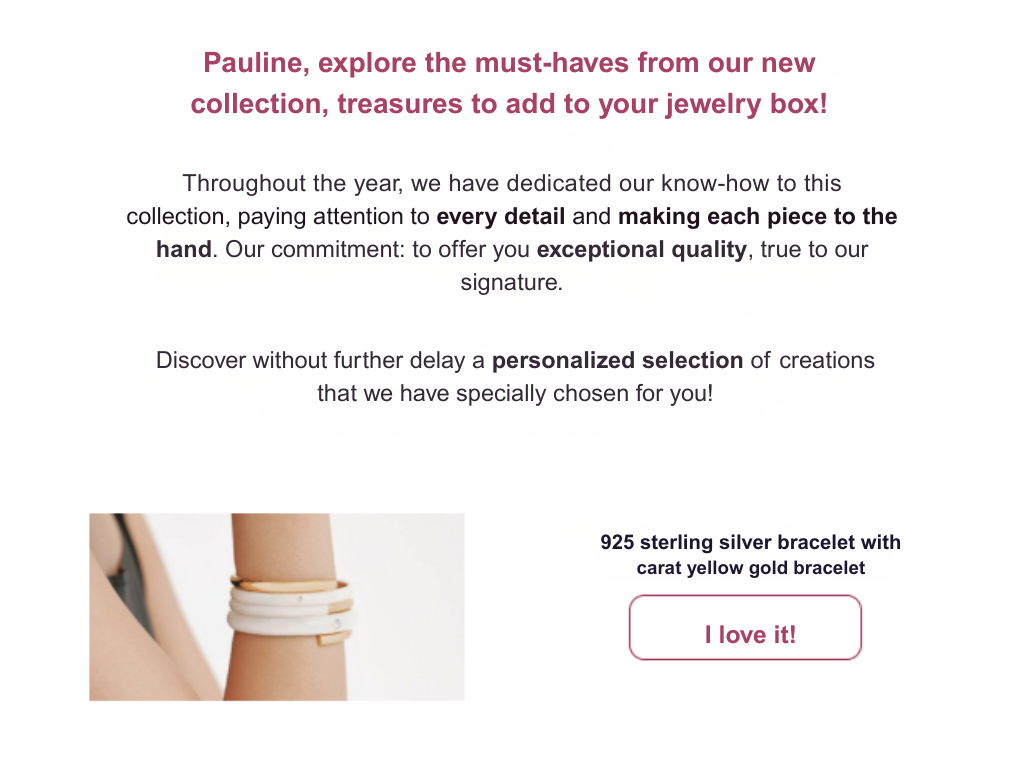
Before writing, clarify the message you want to convey. Then, choose your words carefully, as every word can make a difference.
Why does “explore” work better than “discover”?
- “Discover” evokes a passive revelation.
- “Explore” engages the reader in an active and immersive process.
👉 “Explore our new collection” invites curiosity and action.
Why talk about “treasures” rather than “jewels”?
- “Treasures” evokes emotion, rarity, and sentimental value.
- It breaks away from typical jewelry vocabulary and creates a poetic image.
👉 “Add these treasures to your jewelry box” sounds like a personal promise.
Think of your content in the long term
A good newsletter is not improvised. It fits into a consistent editorial strategy. To achieve this:
- Create an editorial calendar that includes your key commercial periods.
- Take seasonality, current events, and special days into account.
- Always bring value to your readers: tips, inspiration, exclusives.
- A good newsletter is a blend of form, content, and intention. Every word, image, and button must have a clear role in your reader’s journey.
Tailored experience
Why personalization is essential in your email campaigns
Today, personalizing an email goes beyond simply inserting the recipient’s first name in the subject line or header. Truly effective personalization relies on the smart use of behavioral and profile data of your contacts.
Personalization that strengthens engagement
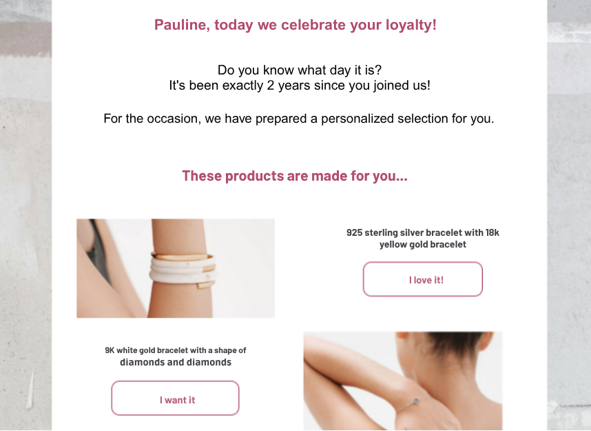
Let’s take the example of a newsletter addressed to Pauline, a loyal customer for 2 years. Thanks to precise personalization, you can:
- Create an emotional connection: by addressing her directly and highlighting her loyalty, you strengthen the relationship with your brand.
- Value loyalty: mentioning the length of the customer relationship shows you’re paying attention to her journey.
- Improve engagement rates: a personalized message grabs more attention and encourages exploring the offered content.
- Offer a tailored experience: by suggesting a selection of products matching her tastes or habits, you make your email much more relevant.
Personalization tools in your templates
In your Fastbuilder campaign editor, you have several personalization tags: title, first name, registration date, birthday, etc. These tags are automatically replaced with the recipient’s information at the time of sending.
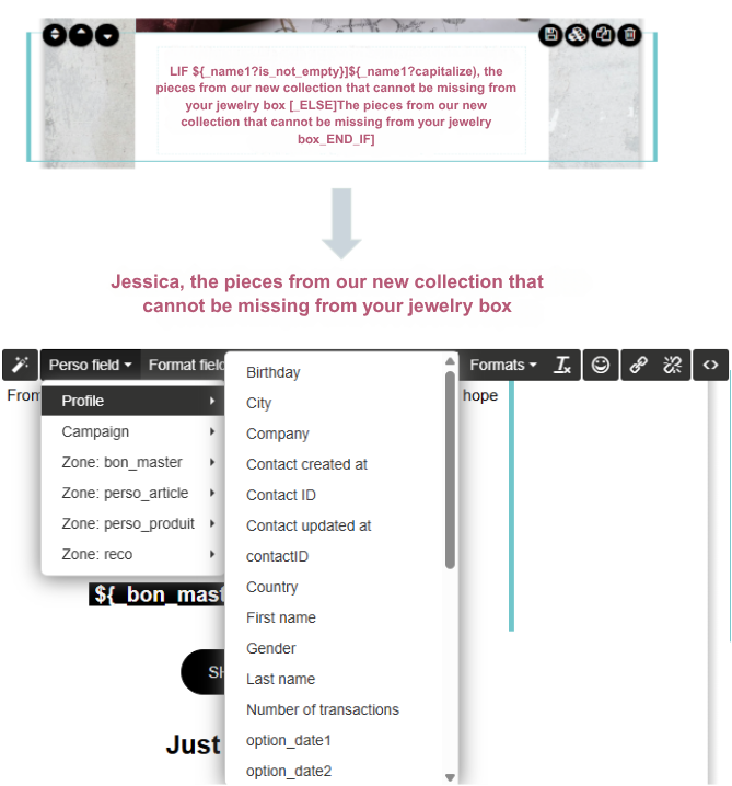
Formatters allow you to adjust the display of this data:
- Uppercase formatting for the last name
- Long date format (“February 12, 2023”)
- Capitalizing the first letter of the first name
- …
To learn more, check out our article Personalizing your emails with your recipients’ information.
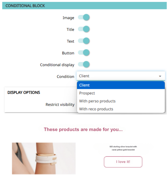
Conditional display: tailor your content to each profile
Thanks to conditional blocks, you can dynamically adapt the content of your newsletter:
- Display a recommendation block only if the recipient has any.
- Reserve a promotional offer for new prospects.
- Offer a specific selection to loyal or frequent customers.
This level of personalization allows for smart targeting:
- Buyers
- Prospects
- Contacts with recommended or personalized products
RECO vs PERSO: two types of dynamic offers
- PERSO offers: products the contact has already interacted with (purchase, add to cart, visit).
- RECO offers: recommendations based on the contact’s behavior, selected by Probance algorithms from the most popular or fast-growing products, not purchased in the last 180 days.
These selections are based on:
- Most visited category
- Favorite brand
- Purchase history
Set up your product blocks efficiently
In the Content tab of the recommendation block:
- Set the maximum number of products displayed (up to 6).
- Choose the desired display format (list or columns).
- Select the product information to show (price, label, image, etc.).
⚠️ Do not include multiple recommendation blocks in the same email to avoid repeating the same products.
Filter recommended products
Add selection filters to more precisely target the displayed products:
- Products in stock
- Price below a certain amount
- Specific categories or brands
To learn more about how filters and product recommendations work, check out our article Integrating personalized product recommendations in your emails.
Minimum number of offers
Set a minimum number of products required for the email to be sent:
By default: this threshold is set to 0 → the email is sent even without recommendations.
Set a minimum of 6 offers → the email will only be sent if the algorithm finds at least 6 products.

💡 In this case, consider conditioning the display of titles or blocks to avoid showing “These products will please you” to a contact without available recommendations.
Key best practices to remember
- Create a personalized experience at every step of the email.
- Combine personalization tags and segmentation for truly targeted communication.
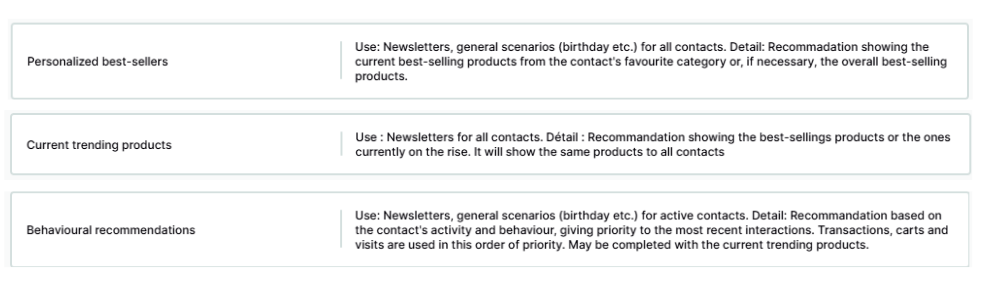
Examples of product recommendations based on behavior
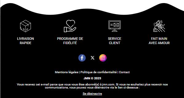
Compliant and reassuring footer
The footer of an email: a small area, a big challenge
Often pushed to the background, the footer (or page bottom) is actually the last impression you leave on your reader. And if your main message hasn’t triggered the desired action, it might be in this area that the final click happens. Sure, click rates here are often low (less than 1%), but neglecting this section means missing one last opportunity to engage.
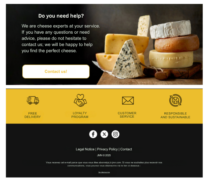
Mandatory elements of the footer
The footer is not just an information area: it is also a space regulated by GDPR and email marketing best practices. Here is what it must include:
1. A clear and accessible unsubscribe link
- Explicit wording like “Unsubscribe” or “Manage my preferences”
- Unsubscribing must be possible with one click
- This link must be visible, not hidden in a paragraph with tiny font (6px)
2. Legal notices and sender information
- Company name
- Full postal address
- Legal status, registration number (e.g., SIRET for France)
- Link to privacy policy or terms of use
Enhances transparency and trust
Add a sentence explaining why the contact receives this email to reassure the reader and strengthen your credibility:
“You are receiving this email because you subscribed to our newsletter on our website.”
Additional opportunities to include
Even if interaction rates are low, the footer can host extra elements that enhance your brand image:
- Links to your social networks: to boost engagement or strengthen social proof
- Une note environnementale : pour sensibiliser et encourager des gestes simples
“Please consider deleting this message after reading to help preserve the environment.”
Design: simplicity and readability first
A well-designed footer is clean, readable, and responsive. Some rules to follow:
- Mobile version: avoid long blocks of text that cause unnecessary scrolling
- Appropriate font size: avoid unreadable characters (6px or less)
- Clean design: keep it simple, with a good balance between text, icons, and spacing
- Visual quality: take care of your icons and images; nothing worse than a blurry or pixelated logo at the bottom of an email
Need help designing your newsletters? Don’t hesitate to discuss it with your account manager!